Study Notes
Calculating Breakeven Output - Chart Method
- Level:
- AS
- Board:
- AQA, Edexcel, OCR, IB
Last updated 22 Mar 2021
Using graph paper, it is possible to chart the financial data that allows the break-even output to be measured. Let's look at an example.
Step 1
The first step is to produce two axes:
The vertical axis shows the value of sales & costs
The horizontal axis shows the output
So here is what the blank chart would look like:

Step 2
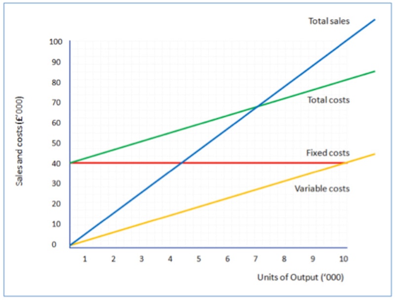
The next step is to add the fixed cost line. Remember that we assume fixed costs don't change with the level of output. So the fixed cost line (in red below) is a horizontal line, showing £40,000.

Step 3
Next we add the variable costs. We assume that variable costs vary directly with output. In our example, the variable cost per unit is £4. So variable costs for 1,000 units will be £4,000, and at 5,000 units they will be £20,000. Remember that you only need to plot a couple of points to be able to draw the straight line (in yellow below).

Step 4
Next step is to add the variable costs to the fixed costs for each level of output. This is important. Remember that to calculate break-even we need to know total costs. The total cost line is shown in green on the chart.

Step 5
Having dealt with costs, we can now draw the line for total sales. Remember that we assume that all output is sold for the same selling price (in this case - £10 per unit). So total sales for 2,000 units will be £20,000; 10,000 units will make £100,000 of sales. The total sales line is drawn in blue below.
Step 6
Almost there! The last step is to use these lines to identify certain information from the chart.
First, the break-even output. Remember this is the point where total sales = total costs. So the output is the point where the total sales line crosses the total costs line (e.g. where the blue line crosses the green line). Find this point on the chart and then follow a vertical line down to the output (horizontal) axis. You can see this brings us to 6,666 (approximately, since our chart isn't drawn perfectly to scale!).
Another thing you can notice from the chart is the over a range of output, total costs are higher than total sales (green line higher than the blue line). That means that in this range, the business is making losses. This is the loss-making range of output.
If the actual output is more than the break-even output, the business will be making a profit. In our example, any output more than 6,666 units will mean profits are earned.
The difference between the actual output and the break-even output is known as the "margin of safety". For example, if actual output were 8,000 units, then the margin of safety = 8,000 units less 6,666 units = 1,334 units.
You might also like
Breakeven Analysis
Teaching PowerPoints
Calculating Profit, Contribution and Breakeven
Topic Videos
Contribution and Contribution per Unit
Study Notes
Calculating Breakeven Output - Formulae
Study Notes
Breakeven and Contribution (GCSE)
Study Notes
Operations: Introduction to Break-even Analysis
Study Notes
Breakeven Point (GCSE)
Study Notes
Introduction to Business Costs (Revision Presentation)
Teaching PowerPoints